
Colour Psychology in Marketing: How Colour Quietly Convinces Customers to Choose You?
Discover how colour psychology in marketing shapes customer decisions, brand perception, and conversions & how to choose the right colours for your brand.
Understanding colour psychology in marketing is no longer optional for brands that want to grow; it's a strategic advantage hiding in plain sight. Before a customer reads a single word on your website or packaging, their brain has already made a subconscious judgment, and colour is the single biggest factor driving that judgment.
Research published on ResearchGate confirms that 62–90% of a person's perception about a product is based on colour alone, formed within the first 90 seconds of interaction. Brands that use colour consistently across platforms see brand recognition by up to 80%.
In this blog, we break down the science of marketing colour psychology, how it shapes consumer behaviour, & most importantly, how you can apply it strategically to stand out, build trust, and convert more customers.
What is colour psychology in marketing?
Colour psychology in marketing is the study of how colours affect human emotions, perceptions, and buying behaviour. Rooted in behavioural science, from Goethe's early work on colour emotion to modern neuromarketing, it helps brands choose colours that communicate their values without saying a word.
It matters because:
1. First impressions are fast and colour-driven: People make judgments about products within 90 seconds, and colour plays the most significant role in those judgments.
2. Visual appeal shapes expectations: Colours can influence perceived product quality, value, and personality.
3. Colour affects choices: In many purchase decisions, colour is one of the strongest initial differentiators between products.
This article will explore how top brands use psychology to their advantage, and how you can apply proven principles to your own branding.
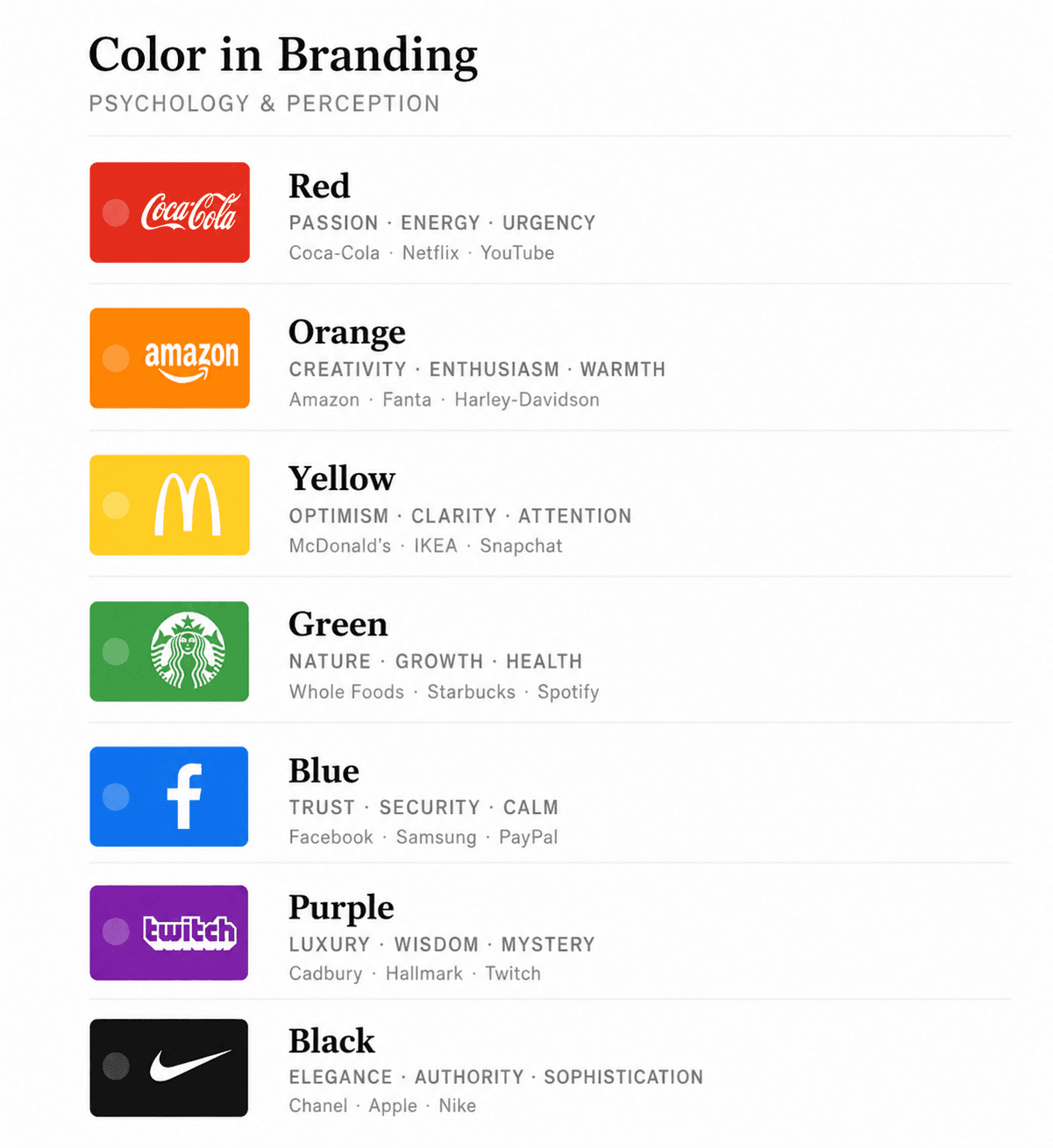
Meaning of colour in branding-
Different colours carry emotional and psychological meanings. When used intentionally, they can anchor brand identity, grab attention, and influence decisions.
Here are a few examples:
Colour | Perception | Brand as an example |
Red | Urgency, excitement, energy | Coca-Cola uses red to create a bold, energetic feel. |
Blue | Trust, calm, reliability | Facebook and Twitter use blue to encourage trust and comfort. |
Green | Growth, vitality, freshness | Starbucks uses green to signal freshness and nature. |
4 Core Colour Theories That Power Branding -
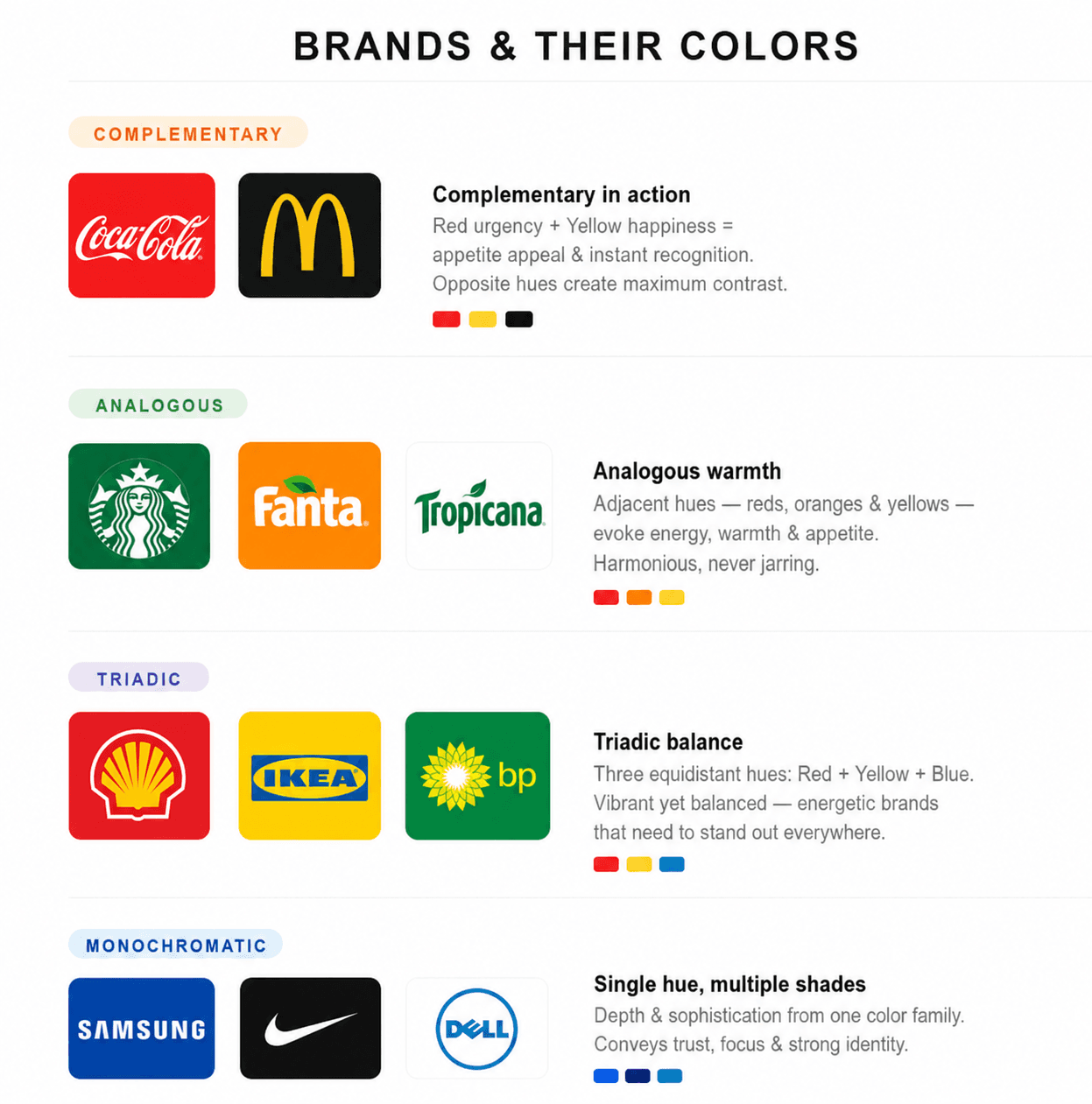
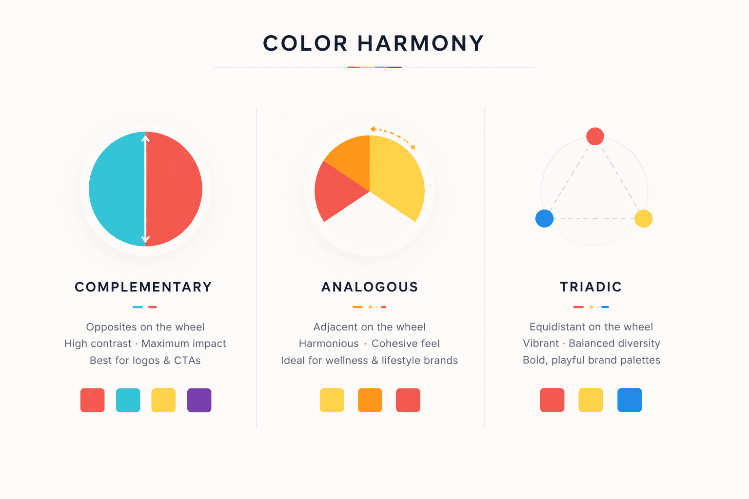
1. The Colour Wheel / Colour Harmony Theory:
Firstly, it was introduced by Newton; the colour wheel remains one of the most practical tools in marketing colour psychology. It allows designers to combine colours in ways that are both visually pleasing and strategically purposeful.
Complementary colours (opposites on the wheel) create a strong contrast. This is ideal for Logos & CTA (call-to-action) buttons.
Analogous colours (adjacent hues) produce harmony & cohesion, perfect for wellness brands.
Triadic schemes feel playful and dynamic: Tide's orange, yellow, and blue palette is
classic example.
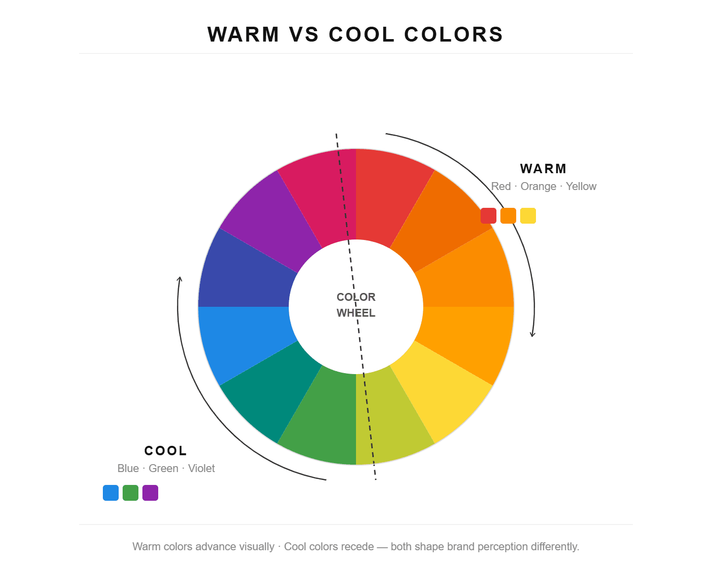
2. Warm vs. Cool Colour Theory:
Warm colours (red, orange, yellow) signal energy, urgency, and excitement that are commonly used in food, retail, and entertainment. They encourage faster decision-making.
Cool colours (blue, green, purple) signal trust, calm, and stability. This is dominant in finance, healthcare, and tech. This is why banks nearly universally lean on blue: it subconsciously signals safety and credibility.
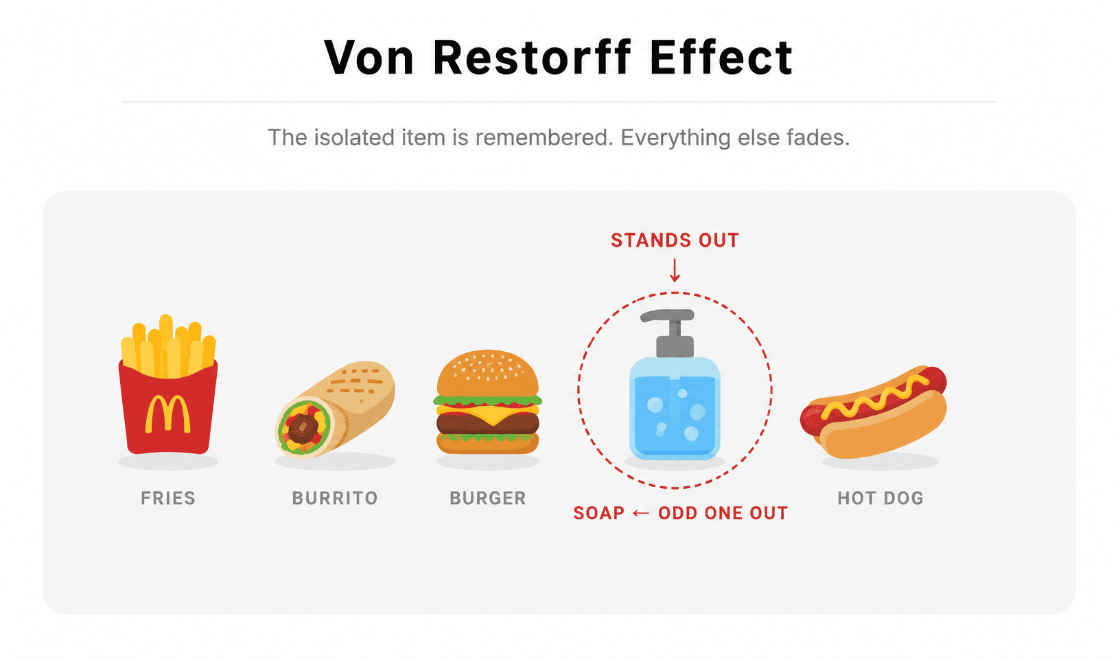
3. The Von Restorff Effect (Isolation Effect):
This principle states: “What stands out gets remembered.” In branding and UI design, it guides the use of colours for emphasis.
Applications:
Bright CTA buttons on neutral websites
Limited‑time offers highlighted in contrasting colours
Key messages framed in standout tones
When a colour sharply contrasts its surroundings, the brain notices it first, directly influencing clicks and conversions.
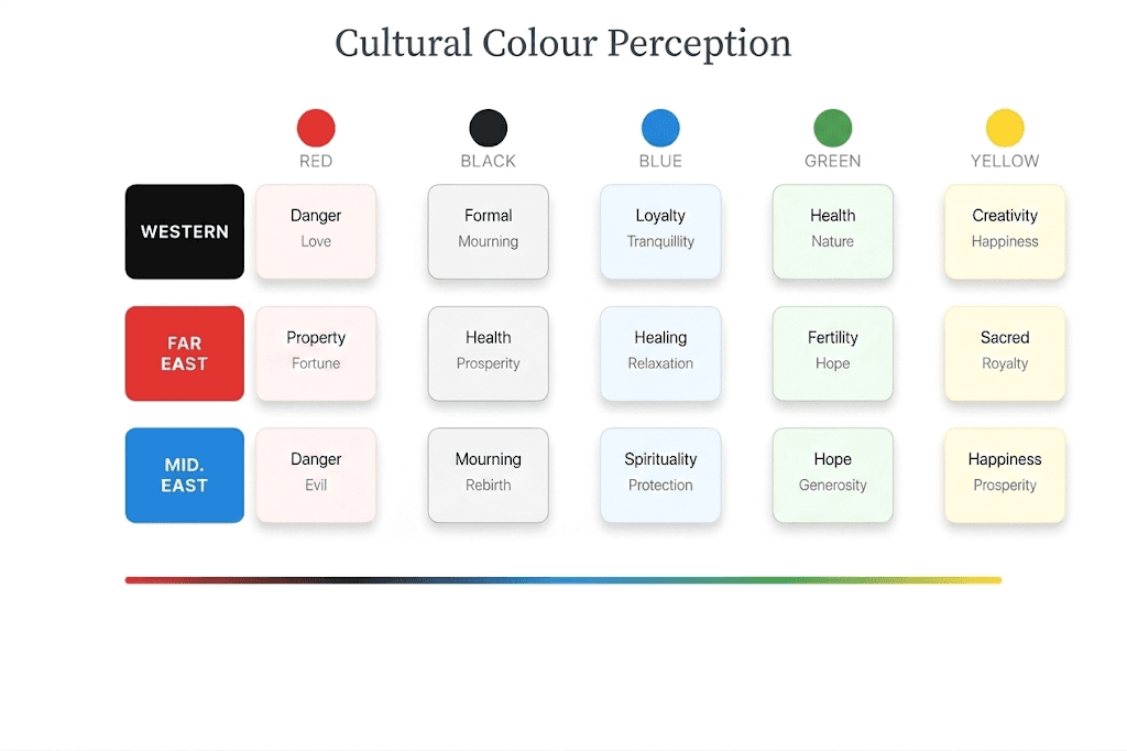
4. Cultural Colour Theory:
Colour meanings shift across cultures, and global brands must adapt.
Red - Luck and prosperity in Asia, urgency in Western markets
White - Purity in Western weddings, mourning in some Eastern traditions
Green - Nature in eco‑branding, wealth in finance
Brands that respect cultural colour meanings build stronger resonance and avoid miscommunication.
How to Choose the Right Colour for Your Brand?
85% of consumers say colour is the primary reason they choose one product over another. When applying colour psychology in marketing to your own brand, consider four pillars:
1. Psychology - Anchor choices in emotion, blue for trust, red for urgency, green for growth.
2. Audience - Younger audiences respond to bold contrasts; luxury buyers gravitate to muted, elegant tones.
3. Industry - Tech brands lean into blues/purples; wellness brands embrace greens and neutrals.
4. Context - Always test colours across platforms; Instagram, website, and packaging can render very differently.
Common Colour Mistakes to Avoid
Many brands stumble when it comes to colour, and the consequences can be costly. Research shows that up to 90% of initial product judgments are based solely on colour, and consistent use of colour can increase brand recognition by as much as 80%. Yet mistakes are common: overloading the palette with too many colours dilutes recognition, while ignoring accessibility, such as low contrast, can make text unreadable and alienate audiences. Chasing trends blindly, like neon gradients, may feel fresh but can quickly date a brand, undermining timelessness. Finally, mismatching tone is a frequent error; for instance, a playful pastel scheme might suit a lifestyle brand but would clash with the seriousness of a financial consultancy. Alignment matters more than aesthetics, and colour must always serve the brand’s identity, audience expectations, and long-term recognition.
How Colour Affects Conversions?
Colour doesn’t just shape perception - it drives measurable business outcomes. Research shows that people form an opinion about a product within 90 seconds of first seeing it, and 62–90% of that judgment is based on colour alone. Call-to-action (CTA) clarity is one of the most powerful levers: studies indicate that red CTA buttons are up to 34% more likely to boost clicks and sales compared to other colours. Emotional triggers also play a role - warm tones like red and orange accelerate decision-making for limited-time offers, while cool tones like blue and green foster trust in sign-up flows. Consistency across ads, landing pages, and checkout reinforces reliability, reducing drop-offs and building confidence. Finally, micro-testing matters: A/B experiments on CTA colours, banners, and overlays often reveal surprising audience preferences, proving that even small shifts in hue can create significant lifts in engagement and conversions.
How the Right Colour Transformed These Brands?
Let’s take an example of Yuvrit Ayurveda, Goldenflitch worked with this brand from scratch, helped with branding, logo, business cards, & so on. It helped the brand to grow rapidly! But the most important factor that helped them was the “colour palette”.
A. The use of this deep, earthy green helped them to connect with India’s natural landscape and traditional healing practices, which symbolise the strength and vitality of Ayurveda. Its grounding tone resonates with India’s heritage of using natural health remedies, especially in addressing chronic conditions holistically. The green establishes a sense of trust, reminding clients of age-old wisdom rooted in nature.
B. This use of warm beige tone recalls the soothing colours of Indian soil and traditional Ayurvedic powders, providing a calm and welcoming foundation. Its soft, neutral presence reflects the timeless quality of Ayurveda, making it ideal for chronic health solutions that emphasise patience and long-term healing. This colour subtly hints at Indian heritage, adding warmth and comfort to the brand.
C. The terracotta hue reflects the earthy tones of Indian clay and the warmth of spices used in traditional medicine, symbolising vitality and rejuvenation. By adding an energetic yet natural touch, it emphasises the brand's proactive approach to wellness and healing.
This red brings in the vibrancy of Indian culture, making it memorable and tying it to a sense of cultural heritage.
D. The gold-beige colour reflects Indian royalty and heritage, lending an elegant, timeless feel to the brand’s message. It’s reminiscent of the rich, organic shades found in traditional Indian textiles and decor. Used in text, it provides clarity and sophistication, blending the brand’s modern solutions with the wisdom of ancient Ayurvedic practices tailored to chronic health solutions.
FAQs’
1. Can I just pick my favourite colour?
No, it must align with audience psychology and brand values.
2. Do colours really affect conversions?
Yes, even subtle CTA colour changes can lift clicks and sign-ups.
3. What if my competitors use the same colour?
Differentiation comes from how you combine and apply colours, not just the hue itself.
4. Do I need to stick to one colour forever?
No, but consistency builds recognition. You can evolve palettes strategically over time.

Let’s keep in touch.
Discover more about high-performance web design. Follow us on Twitter and Instagram.
