

Solutionec needed a brand that conveyed innovation, speed, quality, and empathy while standing out in a competitive tech landscape.
Our challenge was to create a versatile identity that bridges marketing and product interfaces, ensuring consistency across diverse media while resonating with varied audiences. We addressed this by crafting a dynamic, human-centered visual system.

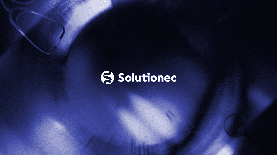
The Logo
Solutionec Logo was created with the aim to combine a sans-serif friendly- looking font with the symbol of the combination with the puzzle- like elements which come together to form the letter “s”. The “circle” while mainly used in order to convey completeness and commitment. The symbol can also be seen as DNA, hence pointing to the domain in which “solutionec” activates, healthcare.
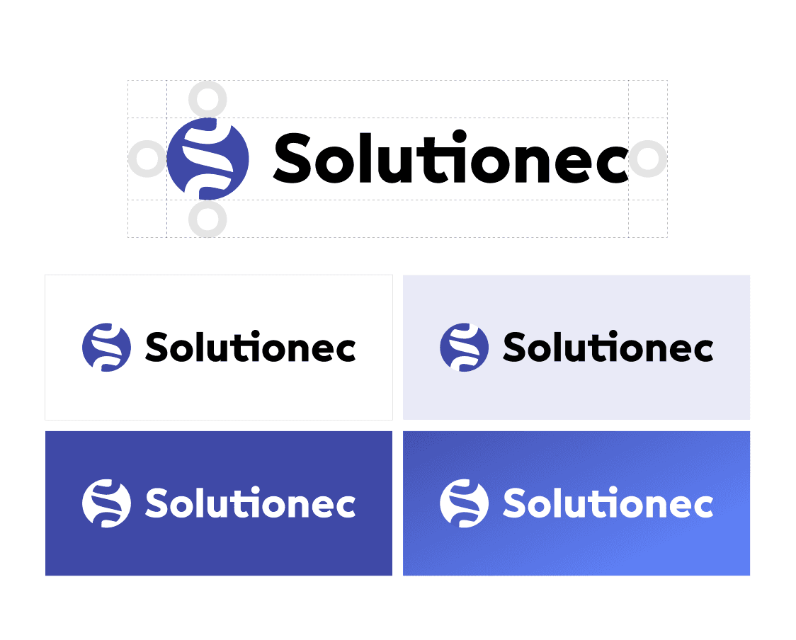
Color Palette
The primary color, blue, unifies Solutionec’s marketing and product interfaces, enhancing visual recognition. Minimal use of black, white, and greys for body text ensures clarity. Our color strategy, designed for versatility, strengthens brand familiarity across diverse touchpoints.

Font of our Choice: Inter
We selected Inter as the primary font for its modern, screen-optimized readability, ideal for Solutionec’s digital focus. Arial, used as a secondary font for default purposes, ensures broad accessibility. Our typography system balances clarity and sophistication, enhancing brand communication across platforms.


Photography
Our photography guidelines focus on genuine, action-oriented imagery that captures Solutionec’s expertise and customer stories. Each photo reflects the brand’s mission to empower businesses, using emotive, natural visuals to engage audiences and convey a performance edge.
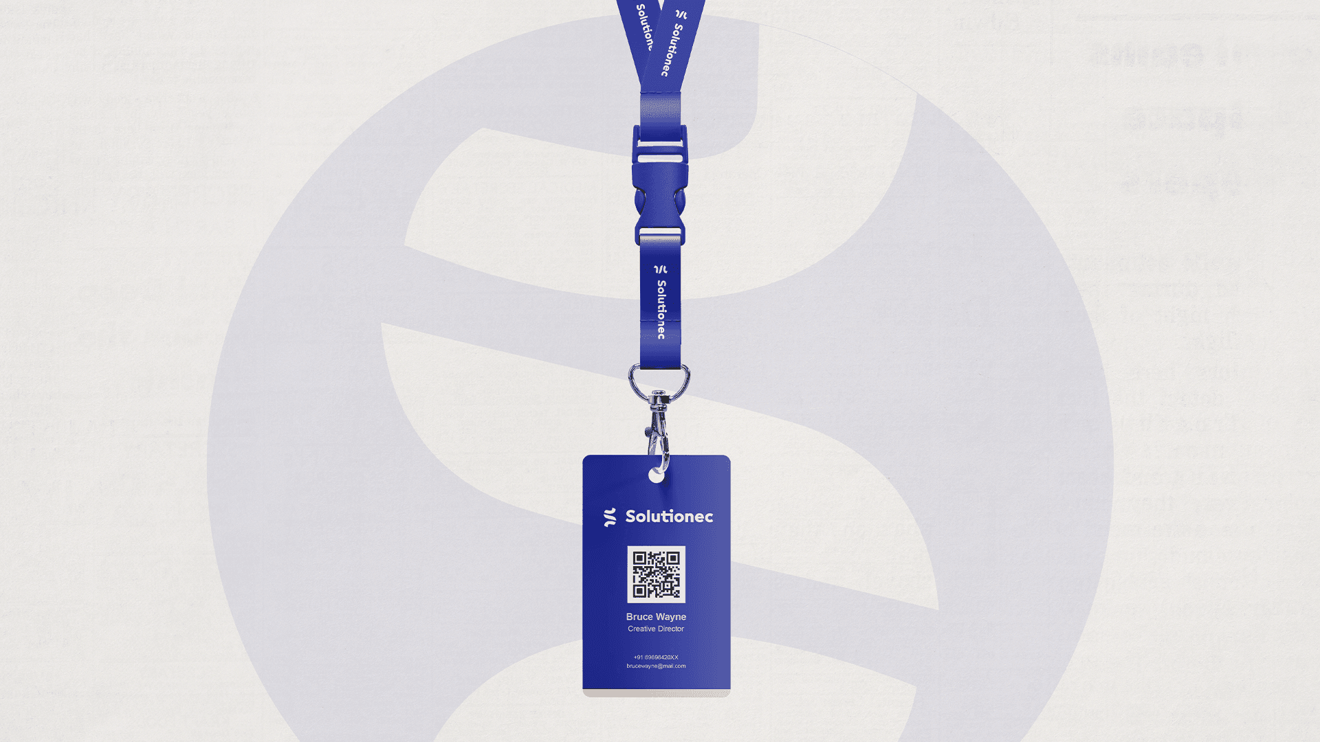
Additional Branding Elements
We designed business cards, letterheads, standees, banners, social media posts, brochures, email templates, and merchandise. These assets, crafted with Solutionec’s brand guidelines, ensure a cohesive and impactful identity across all touchpoints, reinforcing their innovative and empathetic ethos.